www.enhencer.com
Turn Data to Profit in Minutes
Predict customer's behavior with the most practical Automated Machine Learning platform.

www.enhencer.com/churn-prediction
Churn Prediction
Focus only on 5% of your customers who are 90% likely to leave.Know who they are and how they behave.Take the right actions to the right customers at the right time by decreasing your marketing costs.

www.enhencer.com/purchase-propensity
Predict Purchase Propensity
Increase the positive return of such campaigns up to 90% and learn why and how the marketing campaigns are made effective against which customer group.

Saturday, November 1, 2014

Introduction to Qlik Sense in Singapore

Qlik has recently intoduced its brand new product, Qlik Sense, and as a Qlik partner, Knowledge Management Solutions is starting a series of apps build events in the upcoming months to introduce this exiting new product.

Known as "Build Your First Data Visualization Dashboard in half-day", this 4 hours free Qlik Sense introduction offers a hands-on experience with this new self-service Business Intelligence solution. Qlik Sense free desktop application will be used in the session so there is not license cost at all.

The apps build session is on 9th January 2015 between 10:00 AM and 14:00 PM and will cover a hands-on session where you will build your first Qlik Sense Business Intelligence Dashboard with a Qlik Sense expert. See below for details and to register.

Build Your First Data Visualization Dashboard in half-day!
Data Analytics with Qlik Sense

You are invited to join Knowledge Management Solutions Pte Ltd for Data visualization by Qlik Sense Desktop Session.

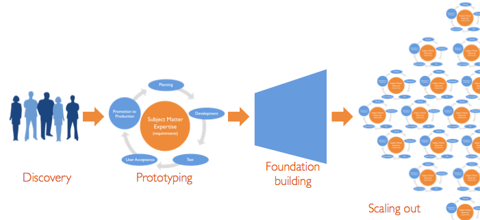
The hands-on approach allows you to build a Qlik Sense application that integrates real data from several different sources and presents it in dashboards, analyses and reports.  Qlik Sense Business Intelligence dashboards allow organizations to analyze data quickly.  Its intuitive user interface means there’s no need for canned reports, dashboard widgets, or templates to get started. Through Qlik Sense’s disruptive, in-memory associative approach, business users have experiences unprecedented success and satisfaction.

Qlik Sense
Who should attend?
Business people, General Managers, Analysts, Operations Managers, IT Managers, HR Managers, Finance Managers, Marketing Managers, Sales Managers, Service Managers, etc.

What you will learn during the hands-on session:
You will build your first Qlik Sense Business Intelligence Dashboard.


This training will be provided by our key consultants who on average have more than 15 years of experience in Business Intelligence and Analytics.

Seats are limited hence we encourage you to register early to secure your seat(s).

Date: 6th March 2015 (Let us know if this date does not work for you. We will inform you for the next event).
Time: 10 am to 2 pm (registration starts at 9:45 am)

Venue:  9 Temasek Boulevard #17-02, Suntec Tower Two S(038989), Singapore
Agenda:
1. Introduction to Qlik Sense Business Intelligence
2. Create your Business Intelligence Application with Qlik Sense
Tea Break
3. Data extraction from different sources
4. Data modeling
5. Design of graphs and charts
6. Build your advanced dashboard (Analytics and Reporting)

If you would like to join us kindly send an email to levent@kms-world.com with your name, designation, company, and official email and phone details or click below to register.


Qlik Sense has been launched on September 17th 2014 a few months after its free desktop application was released. Qlik Sense is built on the QIX Associative Data Indexing engine, the second generation of Qlik’s proven and patented engine technology. Associative data engine leaves data associations to Qlik Sense platform which frees users from IT stuff like writing queries or connecting filters and charts with each other. On top of this, Qlik Sense also offers a drag-and-drop application development environment which allows business users to develop their small to medium size BI applications without relying too much on it.

Below you can watch an introduction video.

Friday, October 24, 2014

What is Tableau Drive?

With skyrocketing revenues and number of 100K USD deals (a gauge showing enterprise adaptation of a business software), Tableau is getting fast into enterprise-wide BI deployment. As the emphasis on "Tableau for Enterprise" was significantly higher in this years Tableau Customer Conference (September 2014), Tableau Software has also released Tableau Drive, a  methodology for scaling out self-service analytics.

So what is Tableau Drive? This is a freely available methodology relying on iterative, agile methods that are faster and more effective than traditional long-cycle deployment. A cornerstone of this approach is a new model of a partnership between business and IT. In Drive methodology, IT owns the “Center of Operations” and business owns analytics and the “Center of Evangelism”.

Tableau Software released the methodology ahead of Tableau 9.0 which is expected in the first quarter of 2015. Tableau 9.0 is expected to have a lot of improvements in scalability some of which were showcased in September's event.

Drive has 4 phases "Discovery", "Prototyping", "Foundation Building" and "Scaling Out".

The 4 phases of Tableau Drive

Tableau ready for Enterprise BI

Tableau, one of the most popular BI tools in the market today, is truly an amazing and comprehensive platform. Yet, many still think that Tableau just an eye candy toy tool, good for making pretty pictures but not for a serious, enterprise BI level platform. This is absolutely not true (if this was true, Tableau would not be in the leaders quadrant of Magic Quadrant for Business Intelligence and Analytics Platforms 2014).

Tableau offers tremendous efficiency, productivity, flexibility, performance and cost savings. Some discovers this accidentally, they bring Tableau in the project as their personal tool to understand data and then Tableau's highly viral nature carries it into the hearth of enterprise BI. Some innovative project teams head starts enterprise BI with Tableau and usually awarded successful implementations ("usually" because some teams will always have the ability to screw up projects even with great tools). You can see this in numbers. In Q2 2014, there were 157 $100,000-plus deals (a usual KPI to measure enterprise success of BI tools) and the number is increasing fast.

And yet the best part of the story is that Tableau Software, the company developing Tableau, is working hard to make it more enterprise ready in every release.

Tableau 9.0, the upcoming major version release, will most probably carry the product to a much higher level. September 2014's Tableau Customer Conference was the most important indicator of this ground breaking shift : "Tableau for Enterprise BI" was more emphasized compared to previous years. In an interview with InformationWeek, Tableau's VP product management Daniel Jewett, said that they have had a roadmap for how to bring 'analytics at scale' for five years. In the conference of September, Tableau Software also announced a massive update of its data engine that will bring support of parallel queries on machines with multicore processors, resulting in a 4x speed increase, company executives said.

Another gesture of focus for wide-scale enterprise deployments was the introduction of Tableau Drive, an implementation methodology and a set of services. Based on iterative, agile methods that are faster and more effective than traditional long-cycle deployments, Tableau Drive, is freely available.

Tableau is also commercially more effective compared to many competitors out there. Although Tableau server license pricing is not public, I would say it scales up very well without going into "Oh-my-Gosh" region in terms of Dollars.

Tuesday, October 21, 2014

QlikView Training in Singapore

QlikView is one of the most popular and powerful business intelligence platform in the market today. QlikView's distruptive technology makes it a key player in business intelligence industry. With its flexible and powerful analytics environment, building QlikView apps can be mastered by both developers and business users.

Qlik (the company behind QlikView) provides two basic courses for those who wish to learn QlikView : QlikView Designer Training courses for business users and QlikView Developer Training for advanced developers. QlikView Designer course is 2 days and QlikView Developer Training is 3 days. Those who wish to take 3 days developer training needs to take the 2 days designer training.

These two courses are what you can find when you take training from Qlik or some partners of Qlik. But there are alternatives. There is for example a QlikView 11 for Developers material, which covers a more hands-on approach then the standard training. In this course, some powerful and complex concepts are covered better. The material also covers the higher level concepts like how business dashboards should be organized.

With this hands-on QlikView training in Singapore, you can learn to create business intelligence
applications in QlikView platform.

In Singapore "QlikView 11 for Developers" based training is available. Throughout the training, attendees learn to build a QlikView application based on real data that will help a company to make informed decisions and analysis-guided strategies. The application will evolve from chapter to chapter along with the skills of participants, going from a simple proof-of-concept to creating a data model, adding custom styles, building a dashboard, and handling and manipulating the source data by the script.

If you are a developer who is looking for a fast and easy way to develop Business Intelligence applications with QlikView, this course is for you. If you are a power-user in QlikView environment, then you will also find tips and best practices to improve your QlikView skills.

These "QlikView 11 for Developers" courses are conducted in Singapore with QlikView experts (8 years plus experience in QlikView). For course schedule, and details like pricing please go to QlikView Training in Singapore.

Monday, October 20, 2014

Data Visualization for Shipping Industry

This powerful white boarding and demo of a Revenue and Profit Analysis of a shipping company is a rare gem which shows how a powerful data visualization plarform (Tableau in this case) can help companies to analyze their data and dig deep into "why"s.

The video is prepared by a Tableau customer in Indonesia, a leading Shipping and Shipyard Company named PT Usda Seroja Jaya, to introduce their new data visualization platform, Tableau, to their users.

The video starts with a white boarding presentation to illustrate how data analytics can help the company to improve decision making process. The second half of the video is a detailed Tableau demo, a rare data analytics demo for shipping industry. The Tableau demo is also a nice self-service BI presentation for this powerful application.

Tableau is business intelligence software that allows anyone to connect to data in a few clicks, then visualize and create interactive, sharable dashboards with a few more. It's easy enough that any Excel user can learn it, but powerful enough to satisfy even the most complex analytical problems. Securely sharing your findings with others only takes seconds.

Wednesday, October 15, 2014

KMS has been voted and endorsed as the 2014 Top vendor of BI Information Delivery & Analytics

Singapore, October 8th 2014 – Singapore based Business Intelligence Solutions Provider Knowledge Management Solutions Pte. Ltd. (KMS) has announced today that it has been voted and endorsed as the 2014 Top vendor of BI Information Delivery & Analytics by CXO Honour Singapore. Over 700 Chief Information Officers (CIOs) across Singapore were invited to take part in an unbiased online survey with CIOs naming their preferred Vendors in selected segments and categories over the full technology landscape.

The award came as Knowledge Management Solutions was preparing to celebrate its 10th year in Business Intelligence in December 2014. The company, which started as a vendor specific BI solution provider successfully turned itself into a BI Information Delivery and Analytics Solutions Provider in the previous years, offering a decade old experience in BI on some of the best platforms in the market today, QlikView, Tableau and Jedox.

KMS has received the award at by CXO Honour Singapore inaugural Red Carpet Honour 2014 Reception on Wednesday, October 8, 2014 at The St. Regis Singapore.


About Knowledge Management Solutions

Headquartered in Singapore and with offices in Kuala Lumpur, Bangkok and Indonesia, Knowledge Management Solutions (KMS) is one of Asia Pacific regions oldest and largest Business Intelligence and Analytics solutions provider. Incoorporated in 2004, KMS has served more than 400 customers in the region. The company provides business intelligence, data visualization and corporate performance management solution development on top of today’s best agile BI platforms : QlikView, Tableau and Jedox.

www.kms-world.com

About CXO Honour Singapore

CXO HONOUR is a platform that enables an inclusive local community of senior ICM industry leaders to have sustained engagements and partnerships. CXO HONOUR® is a very powerful platform for vendors in the Infocomm & Media (ICM) sector to promote and market their products, services and solutions to the C-level suite (CXO) within the enterprises. 

Wednesday, October 8, 2014

Tableau, Qlikview, TIBCO, SAS, and Oracle gets best business intelligence ratings

Tableau Desktop has been rated as the best business intelligence platform by business software reviews site G2 Crowd users.  Tableau, the long time category winner, was followed by QlikView, TIBCO Spotfire, SAS BI and Oracle BI.

The Grid for Business Intelligence by G2 Crowd rates and profiles business intelligence products. Products shown on the Grid for Business Intelligence have received a minimum of 10 reviews in data gathered by September 19th, 2014. Products are ranked by customer satisfaction (based on user reviews) and market presence (based on market share, vendor size, and social impact) and placed into four categories on the Grid : Leaders, Contenders, Niche and High Performers.

Leaders offer Business Intelligence products that are rated highly by G2 Crowd users and have substantial scale, market share, and global support and service resources. According to G2 Crowd Grid for Business Intelligence, Tableau Desktop, QlikView, TIBCO Sportfire, SAS BI and Oracle BI were leaders in business intelligence domain.

Tableau Desktop received 42 reviews and satisfaction was 99 percent! With market presence score of 61, Tableau overall got a scoring of 80. The second leader, QlikView got 24 reviews and the satisfaction was scores as 85. With market presence score of 54, QlikView got a score of 69. Oracle BI got the highest market presence score but lowest satisfaction in the list.

Other high ranking BI platforms are in contenders category : Business Objects, MicroStrategy, Hyperion. IBM Cognos and TIBCO Jaspersoft.

Birst and Pentaho are listed in Niche category and GoodData BI and Alteryx were High Performers.

G2 Crowd Grid for Business Intelligence Fall 2014
 You can see the details here at Compare Best Business Intelligence Software.

G2 Crowd defines Business Intelligence software as a solution that helps companies gain perspective on their business operations by leveraging data from any internal sources that detail business activity and its results (financial, marketing, operations, etc). The term business intelligence according to G2 Crowd encompasses the process of transforming unstructured business data into standardized reportable datasets and visualizing that into graphs and tables that expose valuable insights into ROI and process best practices. This software often creates automated reports and dashboards that can be deployed to end users, as well as non-technical user interfaces for business users to slice and dice data on their own and preform ad hoc reporting. 

Friday, October 3, 2014

Asset Management Dashboard Demo by QlikView Business Intelligence Platform

Asset Under Management analysis is an important part of any financial institution in asset management, private banking and wealth management business. The data can be quite huge and data from many different sources need to be combined to get the big picture. Unfortunately, this process is quite manual in many organizations where plain old MS Excel is used  to perform analysis with usually poor results.

We have seen that a powerful business intelligence platform can be leveraged for wealth management, asset management and private banking institutions to increase analyis productivity greatly. But what is developed is usually not public (even dashboard layouts are protected) so you can not see a lot of nice asset management business intelligence dashboards.

This rare Asset Management demo provides an analysis of assets under management by various dimensions such as asset class, investor, fund type and region. Users can look up funds and their performance and analyze fund details. The source data are from multiple systems such as AUM, Positions, Risk, Returns, Traiding, Portfolio etc. It also contains a capability to look up a group of CUSIPs on finger tips.

The demo application is developed on powerful QlikView Business Intelligence platform which is heavily used in many finance and banking companies.

The Asset Management application contains an Asset Under Management Dashboard to analyze Overall AUM summary by asset class, investor, fund type, as well as region, Investment Profile View, Trades and Positions Analysis View, Investment Screener View (Multiple fund performance and assets under management summary) and Fund Details view where users can access to an Excel-like pivot table ad-hoc analysis of fund details.

In Investment Profile view, when you select a specific fund, you can print the report in PDF with a simple button click.

Asset Under Management Dashboard
Asset Under Management Dashboard Demo

Free access to QlikView Asset Management Dashboard

You can try Asset Management Dashboard demo by accessing the free public demo application. Fill in your name, e-mail and phone to the below form and press submit button. You will receive an e-mail links to web based dashboard (you can also access through mobile devices), a self-executable file for you to try it locally (no QlikView license required) and supporting material such as demo video.

Please fill in Data Analytics with Qlik Demo/App Request Formform (select "Asset Management Dashboard Demo by QlikView Business Intelligence Platform" in dropdown).

Retailer POS Data Analysis Dashboard by QlikView Business Intelligence Platform

Retailer POS Data Analysis Dashboard demo is designed to give visibility into the Retail environment for Consumer Products companies. The source of data is the Retailer who makes information available from their store EPOS and depot systems to the Consumer Goods company.

This demo gives any retailers a picture of product stock levels in store, depot and in transit, as well as sales analysis. The app supports you in you efforts to deliver improved product availability through allowing your organization to reduce out-of-stocks and lost sales potential, as well as identifying potential alternative sources of replenishment.

The POS Data Analysis is developed on powerful QlikView Business Intelligence platform and utilizes its associative features as well as state-of-the-art GUI. Over 3,000 Retail and Wholesale
Distribution companies globally rely on QlikView to empower business users and decision-makers today, by providing access to on-demand analysis, insights and business discovery.

The application contains several views : Dashboard, Item Analysis, Store and Depot Analysis, Growth Analysis, Days on Hand Analysis, Distribution Analysis and Item Store Mix Analysis.

Below, there are some screenshots from the dashboard application. Below the screenshots you can access the demo package composed of link to online Retailer EPOS Data Analysis application, a self-executable version of the same application and a video demo.

QlikView Retailer POS Data Analysis Dashboard View
Retailer POS Data Analysis Dashboard View


Retailer POS Data Analysis Store and Depot View has Google maps integration
Free access to QlikView Retailer POS Data Analysis Dashboard

You can try Retailer POS Data Analysis demo by accessing the free public demo application. Fill in your name, e-mail and phone to the below form and press submit button. You will receive an e-mail links to web based dashboard (you can also access through mobile devices), a self-executable file for you to try it locally (no QlikView license required) and supporting material such as demo video.


Get Acess to Free Copy of Retailer EPOS Data Analysis Dashboard
Name :
E-mail :
Phone :

Tuesday, September 30, 2014

Excel Plus : From Excel to JEDOX

Microsoft Excel spreadsheet application is by far the most widely used business application on the planet. It is free (well actually not but since comes with every business PC it is perceived to be free), simple, fast, flexible and gives independence to its users. But, a big but, is that MS Excel based processes have several drawbacks : it is inconsistent and error prone, maintenance - intensive, complex and not audit proof, slow and manual to consolidate, difficult to access and collaborate, provides low data-security and there is no process control and workflow.

Although these drawbacks are universal, MS Excel became the basis of complex business processes with many stakeholders and although it sits outside IT-managed systems, it holds business-critical reporting and planning and analysis. Enter the Excel hell!

Jedox is a business intelligence and coorporate performance management platform positioning itself as EXCELPLUS. Excel plus means that JEDOX removes Excel’s drawbacks while retaining its advantages.

Jedox basically transforms the world’s most used reporting and planning tool into the most useful tool. Jedox manages your data, your business rules, and secures your data, yet allows you to still use your Excel expertise. If you know Excel, you know JEDOX and you’ll love Jedox. You can take your Excel-based processes and quickly and easily become a Jedox BI expert, on the web, smartphone or tablet, and the cloud.

Jedox offers Excel Plus and transform the most used business application on the planet, Excel, to the most useful one. 

Data-Driven modeling – Self-Service redefined
With Data-Driven modeling you can quickly and easily analyze data and simulate complex scenarios and then share this interactively to collaborate and drive insight across your organization.

Imagine you can take any data and instantly turn this into a powerful online multi-dimensional dataset that you can share for reporting, dashboards, commentary and for modelling forecasts and scenario planning. That’s what Jedox Data Driven modeling gives you. In one click you go from Excel-hell to Jedox apps that you can instantly and securely access through any device. It’s powerful and easy and empowers business users everywhere.


Enable collaboration and business ownership through instant feedback loops with online data collection and correction, and instant consolidation.

Tableau 9.0 release date and overview

Tableau Software has finally released the new version of its benchmark setting data visualization and business intelligence platform, Tableau 9.0 today on April 7th 2015. The new version comes with an entirely new experience for Tableau Server, significant performance improvements, new data preparation features, drag-and-drop analytics, updates to mapping and much more.


Tableau 8 has been a phenomenal success[1] for data visualization and business intelligence platform provider Tableau Software after the release of Tableau 8.3, everybody was waiting for the new version : Tableau 9. Tableau 9 release date is postponed a few times. In Tableau Conference 2013, the expectation was that Tableau 8.1 would be released in fall 2013, Tableau 8.2 in winter 2014 and Tableau 9.0 later in 2014. Tableau 9.0 release date is later pushed to Q1 2015 and in March one more time to April 2015.

But this is a release worth waiting. There are many significant improvements in Tableau 9.0 over Tableau 8.3 which makes already powerful Tableau Software more competitive.

Tableau User Experience Improvements

Ease of use and flawless data analysis process has always been in the core of Tableau and the company is wisely investing more in this core strength with exiting new features. One of the most significant new feature in the front-end is ad-hoc calculations. You can now write expressions directly on the rows and columns shelves or mark cards with a simple double click. You can later drag these ad-hoc calculations to Data Window to make them reusable calculations.

Tableau 9 Review - Ad-Hoc Calculations
Tableau 9 Ad-hoc calculations feature

A new Analytics Pane in Tableau 9 makes common techniques such as reference lines, bands, totals, trend lines and forecasts readily available by a simple drag-and-drop. Another feature related to Tableau's analytics capabilities is Instant Analytics which provides an interactive experience for comparing summary information about subset of marks to all marks in the view.

New level of details calculation is another exiting new feature which allows you to create arbitrary aggregates in charts without complex and cumbersome expressions. For example, with this new feature, you can easily calculate average sale per customer in each time period by a simple, nested Level of Details Calculation (LOD). LOD syntax also allows you to create fixed values not effected by level of detail in the charts.

Data Connection and Preparation Improvements

Tableau 9.0 now supports Kerberos authentication for Microsoft SQL Server, SQL Server Analysis Service and Cloudera Impala. adds data extraction API for Mac OS and offers new and improved data connectors such as SPSS, SAS and R.

Recently, almost every Tableau release adds more data preparation functionality. Tableau 9.0 is not an exception. Tableau now can detect the range of data in MS Excel files, unpivot tables (converts a cross-tab table to straight table), split data in multiple fields.

Tableau 9 Performance Improvements

Tableau data engine, the in-memory analytics database of Tableau platform, was introduced in Tableau 6 and went through performance improvements since than. But Tableau 9 seems the be the biggest jump. In the presentation, a bar-chart aggregated from 173 million rows of data took 0.7 seconds in Tableau 9 compared to  7 seconds performance of Tableau 8.3 (10x faster)!

As this individual query performance is not enough. Tableau 9 data engine also introduces parallel queries concept. If you have a Tableau dashboard with 3 charts and you do something to trigger a query (i.e. filtering dashboard), each chart queries the database one after another in sequence. In the presentation, a 3 chart dashboard took 9.5 seconds to load. In Tableau 9 it takes 1.1 seconds. Not only individual queries are faster, they also run parallel (provided that underlying database supports parallel queries).

And then comes query fusion. Even if you run parallel queries, why to run a the same query twice if two charts in the view has similar queries which can be run once. Tableau Query Fusion looks at the dashboards and finds way to simply the queries into simple queries.

Suppose that you have two sheets in a dashboard : Sum of Rides per Hour and Average Tip per Hour. In Tableau 8.3, these two will fire 2 individual queries (in sequence) to database. But in Tableau 9, because these two has the same level of details, they will be fused into a single query and run fast. A sample run for 173 million rows takes 3.7 seconds in Tableau 8.3 but only 1.7 seconds in Tableau 9 thanks to query fusion.

So Tableau 9 offers faster queries, parallel queries and thanks to Query Fusion, less queries. And thanks to new External Query Catching, it also offers no queries. Tableau 9 will cash queries in server and desktop and run no queries to database if there is no chance there. In an example run, a 3 sheet dashboard running 9.7 seconds in Tableau 8.3 took only 0.2 seconds to run. 50x improvements.

One of the most desired feature for Tableau 9 is visual ETL (Extraction Transformation and Load) functionality for data quality, validation and cleaning (and data modeling if possible).  Tableau 8.2's "visual data window" seems to be the first step to that direction but we will wait and see if this would be a new feature. Although there are very powerful visual ETL tools which can work seamlessly with Tableau such as Alteryx and Clover ETL, it would be nice to see some more features in this domain with Tableau 9.

On the predictive analytics domain, we expect more functionality in Tableau such as more predictive models and control in newly introduced forecasting feature and better integration with R (current Tableau version can do 4 functions passing parameters to R Server).

We will update this post as more information is revealed about Tableau 9.

[1] - Tableau's Building the 'Google for Data'
[2] - Tableau Gives Up Gains: Estimates Rise, Targets Decline, on Upbeat Q1, Forecast
[3] - Tableau Conference 2014 – A Field Report
[4] - Data Visualization with Tableau

Sunday, September 21, 2014

What is JEDOX?

Jedox is a Self Service Business Intelligence, Analytics and Performance Management platform developed by Jedox AG based in Freiburg im Breisgau/Germany. With a modular structure, JEDOX platform uses Microsoft Excel as its user interface on the one hand and a Jedox-specific spreadsheet on the other, both of which can be used in all common browsers.

Jedox is unique in a sense that while most business intelligence solutions try to replace MS Excel based analysis and planning process entirely with their platform (and usually fails to do so because at one point things are exported to Excel), Jedox puts the powerful MS Excel sheet in the heart of their solution. By doing this they provide a familiar interface to users while enhancing business intelligence capabilities far beyond MS Excel.

This is actually what JEDOX offers in a nutshell : Excel Plus. The modular architecture of JEDOX has a cell-oriented, multi-dimensional in-memory OLAP server that has been especially designed for planning, analysis, reporting, and data consolidation. But for users, it is as simple as using Excel. If you know how to use Excel, you know how to use JEDOX.

Most business intelligence tools like QlikView and Tableau are one way : they get data and distribute them in nice, interactive dashboards but they cannot write back to original data model. You cannot do planning and budgeting in these tools. So most corporations, even if they have a powerful BI tool, they goes back to Excel for planning and forecasting.

Jedox components (Jedox Excel Add-in, Jedox Web, Jedox Mobile, Jedox OLAP and Jedox ETL expands Excel beyond its functionality and adds powerful features like mobile access, BI dashboards and security to the BI solution.

In 2013, Jedox AG has been included in the list of "Cool Vendors" in the Cool Vendors in In-Memory Computing, 2013, report by Gartner, Inc. A key factor for the “Cool Vendor” designation is its unique in-memory technology: Jedox OLAP Accelerator is capable of increasing the processing speed of traditional in-memory technologies (classic CPU multicore architecture) several times over. Jedox leverages state-of-the-art NVIDIA Tesla graphic cards (GPU technology) with internal memory that can be addressed much more quickly. This technology advantage enables blazing fast reaction times when analyzing extremely large data volumes or planning / simulating large scenarios such as multidimensional aggregations and complex rule calculations. Companies can now do planning, analysis, and reporting in real time.

Another interesting feature of Jedox is its powerful data-driven modeling feature where an Excel plain data file can be imported into JEDOX olap with a few clicks, which makes creating an olap model for jedox very easy.

Jedox Product Overview


Jedox 5.1 Data-driven Modelling

Since version 5.1, European business intelligence (BI) software provider Jedox offers a powerful data-driven modeling feature, Jedox users can create an entire OLAP model with existing data at the click of a button, with the model immediately available for analysis, reporting and planning tasks. This new Jedox 5.1 data-driven modeling feature uniquely combines the content depth of classic OLAP tools and the simplicity of state-of-the-art data discovery software.

How data driven modelling works? First, you start with your existing data in Excel. With one click, you create a Jedox in-memory cube. You can now immediately report, plan and collaborate across your organization. This works by automatically generating a sophisticated load (ETL) script to read your data from Excel. The ETL you can edit, extend, and schedule in order to refresh your data as often as you need. The result is you can instantly take any Excel data and immediately use this live through Jedox anywhere.

Since this feature will quickly create a JEDOX model, the data and the interface will be immediately exported to Jedox Web which will open the data to mobile access in a few minutes.

This powerful concept is best demonstrated then writing about. Watch below video for a very nice demonstration from Jedox AG.


Wednesday, September 17, 2014

Qlik Sense vs QlikView

Qlik has finally released its long awaited Qlik Sense platform on 17th September 2014. Qlik Sense is a next-generation self-service data visualization application from Qlik (see more here What is Qlik Sense?). According to Qlik, Qlik Sense is built on the QIX Associative Data Indexing engine, the second generation of Qlik’s proven and patented engine technology.

It has some dramatic changes compared to QlikView, such as drag-and-drop visualization, server side dashboard development and distribution, a token based pricing (Qlik Sense pricing), overhauled data extraction, integrated maps, new charts, etc.

Is Qlik Sense new QlikView or QlikView 12? The answer is no. Qlik started the project as QlikView,Next which was implying that the next product will be the new version of QlikView which is on version 11 released in 2011. But Qlik has changed the name to Qlik Sense. It makes sense because this product is different. Not entirely but different.

Conceptually, Qlik Sense and QlikView targets different types of BI. Here is the semi-official explanation of QlikView versus Qlik Sense which is taken from Qlik Community:

QlikView is a tool for situations where you want prepared business applications, i.e. applications created by developers who put a lot of thought into the data model, the layout, the charts and the formula; and deliver the applications to end-users who consume the applications. Qlik calls this Guided Analytics. The end-user has total freedom to explore data, select, drill down and navigate in the information, and can this way discover both questions and answers in the data. The end-user is however limited when it comes to creating new visualizations. This type of situation will without doubt be common for many, many years to come. For more information on Qlik View, refer to our What is QlikView? QlikView Overview post. 
Qlik Sense is a tool for situations where you don’t want to pre-can so much. Instead you want the user to have the freedom to create a layout of his own and in it, new visualizations; charts that the developer couldn’t imagine that the user wants to see. You want Self-service data discovery, which means a much more active, modern, engaged user. In addition, Qlik Sense is much easier to use when you have a touch screen, and is adaptive to different screen sizes and form factors. On the whole, Qlik Sense is a much more modern tool. (Source : Qlik Sense or Qlik View)
To find out more about Qlik Sense you can check Qlik Sense for beginners.

Technically, Qlik Sense seems to use the same data engine and expression syntax in the back-end. Front end is entirely different. But what would be the road map than? Would Qlik Sense and QlikView merge? There is no official roadmap for now but here are sum hints for the future from Henric Cronström, VP for Product in QlikView:

One of the main goals for Qlik Sense was to have one unified client that could run on anything  (=html5). Another goal was to generalize the chart drawing code, so that more graph types could be implemented (=extensions). A third goal was that the client needed to be adaptable to screen sizes and form factors.

These three goals meant total incompatibility with the existing C++ client, and - unfortunately - only a partial backward compatibility. So, we had to start developing from scratch, but to re-implement all functionality from QlikView 11 in a new tool would take a very long time. And, we just haven't done it yet...

I am not allowed to tell you what we have planned for the future, but I can see several possible scenarios: Merge the two products. Or, QlikView disappears because Qlik Sense is so much better. Or, the two products continue in parallel: QlikView survives and flourishes since it is much more flexible and allows for a much greater customization and Application building.

We will see. I can only promise that Qlik will listen to the customers and make decisions based on the feedback. (Source : Qlik Sense or Qlik View)
What I understand (as many does) from this post is that Qlik is actually working to merge both products but it is still WIP. It seems very likely that both products will merge since Qlik also did not made any major upgrade to its now aging QlikView 11. Maybe QlikView 12 will never be a reality and instead we will see a new Qlik Sense version (a server) which handles all QlikView and Qlik Sense applications on a single platform.


A must have QlikView reference.

Qlik Sense for Beginners

What is Qlik Sense?

Qlik Sense is a next-generation self-service data visualization application from Qlik, a leading data discovery platform provider. Launched on September 17th 2014, Qlik Sense empowers everyone to easily create a range of flexible, interactive visualizations that drive exploration and discovery through intuition.

Qlik Sense is a new product and is not QlikView 12. So now basically Qlik offers two BI platforms: Qlik Sense and QlikView. You can read more about the difference between Qlik Sense and Qlik View : Qlik Sense vs Qlik View.

Qlik Sense is built on the QIX Associative Data Indexing engine, the second generation of Qlik’s proven and patented engine technology. Associative Data Indexing allows people to explore data relationships across many sources that would otherwise be hidden in hierarchical or query-based approaches. Qlik Sense drives faster time to insight with intuitive exploration, smart search, and smart visualizations. It broadens knowledge sharing with data storytelling and mobility. And, it promotes accuracy and reliability through enterprise governance capabilities that make it truly world class. Qlik Sense brings out the business analyst in everyone, taking self-service to a new level of power and flexibility, so that businesses are more informed and capable of acting and reacting faster.

Qlik built Qlik Sense to deliver broad value to everyone in an organization, whether working individually, in teams, or globally. With Qlik Sense, users of all types and skill levels get the most flexible, modern solution for self-service data visualization and exploration. And, IT organizations no longer have to trade governance and performance to provide it. Whether simply consuming, exploring and analyzing, creating visualizations, or collaborating – Qlik Sense provides advanced capabilities that delight and empower everyone.

Qlik Sense Overview Video

Associative Data Indexing

The QIX (Qlik Index) engine is the second generation of the proven and patented engine technology that has powered Qlik products for the last decade. It provides associative data indexing and dynamic calculation that empower people to naturally explore using their intuition. Associative data indexing exposes relationships in complex, multi-source data sets that would otherwise be hidden in  hierarchical or query-based approaches. Users benefit from this feedback every time they make selection or search, allowing them to gain understanding and take next steps.

Self-Service Visualization and Discovery

Qlik® Sense offers a cutting edge visualization and discovery experience in a smart, responsive, HTML5 client that allows people to quickly explore information and gain critical insights. Qlik Sense is built to promote the use of human intuition in all areas of the user experience.

Intuitive Exploration and Discovery

Exploration in Qlik Sense is unmatched. People can ask questions anywhere using simple, natural interactions such as selection and search, without restrictions or boundaries. The QIX engine instantly responds after each click, recalculating all analytics and revealing data relationships through easy to understand color cues – green (selected), white (associated), and gray (unrelated). This empowers users to follow their own paths to uncover insights and blind spots across many data sources that would otherwise have been overlooked.

Global Smart Search allows users to search the entire data set using keywords to uncover insights and relationships. Qlik Sense automatically displays the dimensions where the desired values match. And, if multiple values are entered, Qlik Sense will reveal not only the matching dimensions but also the relationships that exist between the values, ranking the results by the strength of the associations. This provides immediate insight regardless of where information is located.

Smart Visualizations

Smart visualizations in Qlik® Sense offer new, innovative techniques for conveying meaning in data. They feature advanced summarization of information, intelligent use of color gradients, and responsive design that adapts information based on screen size. And, because visualizations are automatically integrated with the QIX engine, they are fully interactive and respond to changes in context from anywhere in the app.

User Driven Creation

With Qlik Sense, everyone becomes a business analyst. People no longer have to wait for reports or changes to analysis. They can simply drag and drop to create – without having to wire objects together or write complex SQL queries. Creation in Qlik Sense is progressive; people only get the level of sophistication they want and need. Governed, centralized libraries of data, metrics, and objects facilitate sharing and re-use and promote consistency and accuracy. And, users can quickly load and combine their own data from multiple sources without the need for scripting.

Sharing of Knowledge and Insights

Qlik® Sense is built for people and place, allowing users to share analyses and insights, and work collaboratively in both office and mobile settings.

Collaboration and Communication

Groups and teams can easily collaborate in Qlik Sense to make better decisions. A centralized information hub offers streams of content for different topic areas or workgroups, allowing people to locate valuable content fast, or share relevant analyses for others to use, in an organized controlled manner.

Interactive Data Storytelling allows people to use analytics to create and present guided stories, rich with narrative and graphics, to communicate insights and facilitate discussion. Multiple stories can be created to offer different points of view. And direct, in-context access to live analysis allows for immediate answers to follow-up questions that arise, reducing delays in decision making.

Anywhere, Anytime Mobility

Qlik Sense is inherently mobile, built from the ground up for mobility. Users get full capabilities on any device, including exploration, analysis, creation, and collaboration. A unified, touch based HTML5 client provides intuitive operation, and responsive design intelligently adapts visualizations, data, and functionality to create the best possible experience on any device. With Qlik Sense, people can instantly solve problems anywhere, anytime they arise.

Broad Adoption and Organizational Intelligence

Qlik® Sense offers developers and IT administrators the ideal set of approaches to build, deploy, and govern information and analytics environments. And it does this while ensuring business users retain the flexibility and self-service agility they need.

Customization, Extension, and Data Integration

Qlik Sense can be fully customized to meet unique business needs, offering a complete set of open and standard API’s for building rich analytic apps, embedding visualizations into existing solutions, and extending the functionality of Qlik Sense for new types of visualizations and objects. And these capabilities can be utilized by developers with standard technology skill sets such as HTML5, JavaScript, and .NET.

Qlik Sense offers robust data integration, allowing organizations to cleanse, transform, and unify multiple disparate data sources without requiring external tools or data repositories. Qlik Sense can connect to and combine virtually any data source, including spreadsheets, databases, operational systems, ERP, and web sources. And with Direct Discovery, resident big data sources such as Hadoop, Teradata, and Cloudera can be integrated without requiring data to be loaded into memory.

Enterprise-Class Governance and Performance

With Qlik Sense, organizations benefit from enterprise capabilities not seen in standalone visualization tools. This allows organizations to offer the flexibility of self-service discovery without having to trade-off management, governance, security, or scalability.

The Qlik Management Console (QMC) offers a central point of management and monitoring for all areas of Qlik Sense, including multi-geography deployments. The QMC provides a large set of configuration options for content and resources that drive quicker deployments, efficient and flexible license management, and proper use of applications, objects, and data. It’s web based, responsive, and touch enabled for access on any device.

Qlik® Sense offers a centralized, flexible rules-based security model which provides customized, robust protection for all areas of the product. Administrators can define security rules based on users, actions, resources, and the environment, for all areas of the product. Governed, centralized libraries help to ensure consistency and accuracy of data and analytics across the organization. And dynamic data reduction provides granular control over information access down to the row and column level.

Qlik Sense is built using an elastic scaling architecture that allows for seamless deployment and expansion across geographies. It includes a Deployment Management Console that allows for rapid setup and management of local and cloud environments to support greater capacity and performance. And with the QIX engine at its core, Qlik Sense scales to high numbers of concurrent users and large data sets, offering industry leading high-speed dynamic calculation and performance.

Qlik Sense Pricing

Qlik Sense is available from 17th September 2014. Qlik Sense pricing is also completely overhauled : Qlik has also introduced a new, more flexible token-based licensing model for Qlik Sense to provide greater flexibility for license management. Qlik Sense tokens can be allocated to named users, or leveraged across multiple login sessions for one or more users. With the token-based licensing model, customers can deploy multiple servers, across multiple geographies, to optimize for performance and availability without paying any additional costs.

Qlik Sense Pricing

Qlik has launched its long awaited product named Qlik Sense. Composed of Qlik Sense, a governed, server-based data visualization and discovery application, and Qlik Sense Desktop, a free Windows desktop self-service data visualization application, the new suite enables server side BI development and distribution, drag-and-drop visualization, smart search and data storytelling.

Qlik Sense pricing is also completely overhauled. The licensing in Qlik Sense (Server) is based on tokens, which are used to allocate access passes that allow users to access Qlik Sense. Token-based licensing model of Qlik Sense is to provide greater flexibility for license management. Qlik Sense tokens can be allocated to named users, or leveraged across multiple login sessions for one or more users. With the token-based licensing model, customers can deploy multiple servers, across multiple geographies, to optimize for performance and availability without paying any additional costs.

Qlik Sense pricing has not been publicly published yet so we cannot write the prices here. If you are in Singapore, Malaysia, Thailand or Indonesia, you can contact us through levent@kms-world.com because in this regions we can help you to understand pricing. For other countries,if you are interested in to find out more about Qlik Sense token pricing and Qlik Sense server pricing, you engage with a local Qlik account manager.

Here are also some useful pages to explore Qlik Sense more:


Also check out these Qlik Sense Resources

Learning Qlik Sense

Qlik Sense for Beginners

Qlik launced full Qlik Sense Product

The wait is over. Qlik, one of the leading data discovery solution provider, has launched Qlik Sense, its device-independent, self-service visualization and discovery product engineered for enterprise-class governance and performance. Qlik Sense product suite is composed of Qlik Sense, a governed, server-based data visualization and discovery application and Qlik Sense Desktop, free Windows desktop self-service data visualization application.

Here is the full press release from Qlik :

Qlik, a leader in data discovery, today introduced general availability of Qlik Sense, the first device-independent, self-service visualization and discovery product engineered for enterprise-class governance and performance.  Built on a modern architecture and powered by the patented, industry-proven Qlik data indexing engine, Qlik Sense gives users the unrestricted ability to create personalized data analyses and explore the relationships that exist in data to reveal connections instantly. Qlik Sense is designed to serve audiences equally without compromise: business users gain the intuitive experience they need, developers gain boundless possibilities for what they can create and IT gains centralized control for management and governance.

Just as Qlik disrupted the business intelligence (BI) industry to pioneer the data discovery category, the company is now leading the next transformation as the category matures to governed, user-driven creation with the launch of Qlik Sense. According to Gartner, Inc.’s 2014 Magic Quadrant for Business Intelligence and Analytics Platform report , “By 2015, enterprise buyers of BI platforms will predominantly purchase platforms that support both strong and broad business-user-accessible data discovery capabilities and IT-driven enterprise features for data reuse, governance, security and scalability.”

“Our vision for Qlik Sense builds on our belief that anyone in an organization should be able to easily create dynamic dashboards to explore their data to uncover meaningful insights,” said Lars Björk, Qlik CEO. “When we set out to create Qlik Sense, we envisioned a world where every knowledge worker, from any device, could rapidly create visually rich analytics to explore theories, prove hypothesis, or discover new trends that can change the trajectory of their business.”

“We have been very impressed with Qlik Sense so far.  For us, simplicity of delivery is key, and it allows us to accelerate the delivery of actionable analytics to the right people at the right time,” said Perry Willis, Head of Information Technology EMEA at Colliers International. “Although we have strong QlikView skills in the IT team, so creation of applications is easy, Qlik Sense allows even greater creation flexibility so we can do more, faster. The synergy we are rapidly developing by using both QlikView and Qlik Sense is helping us provide our Real Estate advisors across 40 countries in EMEA smarter analytics solutions.”

Qlik Sense is the first offering to deliver self-service BI based on a server-side development and distribution model. Whereas most products require separate developer licenses and leverage the traditional approach of develop and publish, Qlik Sense empowers every user with the full capability to create, customize, or extend visualizations from any device, at any point in time.

“The problem with self-service BI has always been that you either get rich BI capability with weak usability, or a very approachable product with limited analysis capability,” said Anthony Deighton, Qlik CTO and Senior Vice President of Products. “With Qlik Sense, we set out to change that. That’s why we built Qlik Sense on the second generation of our patented associative data indexing engine, but gave it a rich, modern visualization front-end that is intuitive, yet powerful.”

Qlik Sense offers the first server side development and distribution model for self-service BI.


Smart Search and Smart Visualizations Accelerate Time to Insight
Qlik Sense lets users create apps through a drag-and-drop experience that delivers relevant analysis, interactive reports, and dashboards critical to decision-making and operations. Users can freely explore their intuition since they are not limited to predefined paths they must follow or questions they must formulate ahead of time. The Qlik associative data indexing engine allows users to easily expose relationships among data dimensions, uncovering insights that would have been hidden in traditional hierarchical, query-based data models. This provides users with the freedom to explore data at any point in their analysis.

Smart Search allows a user to simply type words or numbers to begin analysis of a data set. When a user types in a search string, Smart Search connects the dots, uncovering data relationships and information in locations that might otherwise be unnoticed. In addition, intuitive Smart Visualizations uncover all the relationships between data dimensions, revealing insights that would have been hidden in traditional data models. These cues help users explore patterns by dynamically updating and highlighting new information and associations.

Qlik Sense offers Drag-and-drop visualizations
Qlik Sense offers Drag-and-drop visualizations 

Anytime, Anywhere Collaboration Enables Broader Knowledge Sharing

Qlik Sense puts the social and collaborative experience front and center.  Workgroups and teams can collaborate by collectively sharing analyses anytime, anywhere, and on any device. Its touch-driven interface and responsive design automatically adapts visualizations for the best possible experience on any device.

Data Storytelling allows multiple users, on any device to share their insights at a point in time in presentation format. Users can add commentary and narrative and drill down directly from the presentation to Qlik Sense to answer questions on the fly. This helps to drive communication of insight and facilitates group discovery.

Enterprise-Class Governance and Security Provides Centralized Control

With Qlik Sense, users can build their own visualizations from a centralized library of pre-built data sets, expressions, and visualizations to ensure consistent use of data and values.  Its modern architecture allows new capabilities for governance and manageability to support workgroup and distributed enterprise environments, including license allocation and usage monitoring in an easy-to-use interface that saves time and simplifies troubleshooting. It also enables IT to implement enterprise-level security requirements with a flexible security-rules engine that offers granular control for progressive development with powerful audit and logging.

In addition, Qlik Sense supports robust data integration to transform and combine multiple, disparate data sources and provide seamless analysis across them, including fast calculations, associative exploration, and search. Its open and powerful APIs give developers the ability to embed Qlik Sense into web pages and custom applications, and extend core capabilities to meet custom needs.

Availability and Pricing

Qlik Sense is available today. The Company has also introduced a new, more flexible token-based licensing model for Qlik Sense to provide greater flexibility for license management. Qlik Sense tokens can be allocated to named users, or leveraged across multiple login sessions for one or more users. With the token-based licensing model, customers can deploy multiple servers, across multiple geographies, to optimize for performance and availability without paying any additional costs. For more pricing information, contact Qlik or one of its registered partners.

In addition to offering the complete Qlik Sense offering for interactive visualization, Qlik will continue to offer its market-proven platform, QlikView®, to provide application development that enables analysts with minimal development expertise to build and publish powerful analytical applications. Qlik Sense Desktop, (www.qlik.com/us/explore/products/qlik-sense/desktop) will also continue to be available as a free download.

Thursday, September 11, 2014

Swiss Health and Accident Insurer Helsana choses QlikView

Helsana Group, a leading health and accident insurer in Switzerland, will use uses QlikView Business Intelligence platform to consolidate and analyze data from Teradata, Microsoft and Oracle data warehouses. QlikView will enable Helsana users to perform quick and easy data analysis in the areas of sales, management control and information management.

Helsana required a dynamic analysis tool which is alternative to their existing and cumbersome reporting. Traditional business intelligence solutions are too complex and creates a lot of extra work for the IT department so the company turned to an easy to use and flexible QlikView.

QlikView enables business users to assemble data from multiple sources, explore it, make discoveries, and uncover insights that enable them to solve business problems in new ways. QlikView works the way the mind works. Users conduct searches and interact with dynamic dashboards and analytics from any device. They ask and answer streams of questions on their own and in groups and teams. They forge new paths to insight and decision.

QlikView will connect to existing Teradata, Microsoft (SQL Server), and Oracle datawarehouses which hold all of the data and consolide all of the data sources into a single view, allowing users to quickly and easily track and analyze all of their relevant metrics. The original QlikView deployment was as a management information system, however the organization later chose to expand the solution into their sales organization to perform critical sales analysis. Today, all major KPIs in the sales department are tracked through Helsana’s sales cockpit, powered by QlikView. As an added bonus, Helsana benefits from the synergies of the management information system and sales management now that they are all run on a common platform.

A screenshot from an insurance dashboard running on QlikView platform.
"We wanted a flexible BI solution for standard reporting and ad hoc queries. The key was finding a solution that allowed us to control and analyze live data company wide,” said Harald Roshardt, Head of Analysis & Reporting at Helsana. “QlikView is not only more cost effective than an SAP or IBM Cognos solution would have been, but it also allows us to obtain insights into our current sales activity and analyze the data in seconds. This is all without going through the laborious, manual process we had previously.”

“Helsana is a great example of how the use of QlikView can start in one part of the organization and then spread to other departments to create additional value,” said Chris Christy, National Healthcare Market Director, Qlik. “By enabling business users to manage analytics on their own, QlikView allows organizations to scale their BI deployments in a way that makes sense for their organization, without bogging down the IT department.”

For a detailed overview of QlikView platform, refer to our What is QlikView? QlikView Overview post.

What is Tableau Project Elastic?

Project Elastic is the code name for a new tablet-based product by Tableau Software which was first announced in Tableau Conference 2014. Tableau Elastic Technology is designed specifically with mobile users in mind and aims to help users to ask questions to their data using just their two fingers and making fairly complicated queries, are just a tap, swipe, scroll or pinch away.

Tableau's VP of Mobile, Dave Story, has demonstrated the product in annual Tableau customer conference. What we can see up to now is that Tableau Software is basically building a new iPad app (or tablet app). In the presentation, Dave Story took an email attachment (a data file listing sales information about a local sandwich shop) and opened it in the Tableau Elastic app. The app immediately opens with a view of a chart showing categories of products sold at the shop. As other Tableau user interfaces, Elastic is also "drag-and-drop" based. With taps, swipes and scrolls, you can easily change the dimensions and measures as well as the chart types.

"The idea is going beyond our core audience, which has been business, and reaching out to the consumer. The motivation is what would you do now if you wanted to disrupt or wanted to start over with Tableau." - Dave Story, Tableau Vice President of Mobile

Tableau Elastic release date and pricing is not announced yet. Tableau Software plans to release Elastic as a product at some point in 2015.

You can find more information on Tableau Elastic in its web page, Be-Elastic.

Tableau Project Elastic
A screenshot of Tableau Project Elastic. Taken from Tableau Software web site,

Monday, September 8, 2014

Transport data analytics collaboration of ST Electronics and IBM Singapore

Singapore Technologies Electronics (ST Electronics) and IBM Singapore has announced that they have signed a Memorandum of Understanding  to collaborate on transport data analytics and to exchange technical information about products and capabilities, specifically on the use of smart analytics for urban mobility.

With transport data analytics, governments and companies can better understand the commuting patterns and can optimize the traffic and transportation systems. But since the input data for the transport analytics would be huge and the mathematical foundation of the problem is very complex, powerful platforms as well as expert skills are needed to utilize the analytics.

"IBM is working with organisations around the world to make cities smarter with data driven solutions to attain new levels of insight and efficiency through analytics" said Janet Ang, Managing Director, IBM Singapore. "Our collaboration with ST Electronics (Info-Comm Systems) leverages on IBM’s global expertise in transport data analytics. Through our involvement in existing projects with clients in Singapore, we hope to extend this partnership globally."

IBM Singapore has announced a collaboration with the Land Transport Authority (LTA), SMRT and StarHub to apply fusion analytics to create a state-of-the-art public transport system. The collaboration, announced  on June 2, has been named Fusion AnalyticS for public Transport Emergency Response, or FASTER. It will use data-driven analytic models for better crowd management and public transport incident management.


"This partnership provides an excellent opportunity to leverage ST Electronics’ expertise and proven transport solutions, and IBM’s strength in smart transport analytics products and solutions" LEE said Fook Sun, President, ST Electronics. "Transport data analytics will allow us to better understand commuting patterns in the development and support of a strong data-driven transport infrastructure, with the view to building smarter applications for optimal traffic management and enhancing the travelling experience for commuters."

What is new in Tableau 8.2 Release

Tableau 8.2 was released on June 18, 2014 and Tableau 8.2 Tour stop in Singapore was held on Wednesday July 23, 2014. The new release is already in 8.2.2 (released in August 21) and contains a lot of exiting features. The release includes the first-ever Mac OS version of Tableau Desktop, Story Points for interactive, data-driven storytelling, a more visual connection experience with data previews and improved experience in defining data table joins, and updated maps, in addition to enhancements to simplify administration and support of Tableau Server.

Here is a list of major new features in Tableau 8.2.

Tableau Desktop on the Mac
The revolutionary technology of Tableau Desktop now runs natively on the Mac. It’s the full analytics package, built to support high-resolution Retina displays, Mac-specific controls, and also all of your existing Tableau workbooks.

Story Points
One of the most anticipated features of Tableau 8.2, Story Telling lets you create compelling, interactive, data-driven stories. You can assemble sheets and dashboards into a narrative arc that tells the story in your data. You can capture key insights with annotations, highlights and filters. You can also add descriptions to emphasize findings. Make your story interactive to encourage further exploration.

Tableau Story Points
Visual data window
The data connection experience is redesigned in Tableau 8.2. from the ground up. With the new interface, you can connect to multiple tables, add joins with one click, and preview your data to make sure you've got what you need. You can also modify field properties, add data source filters, and extract your data.

Tableau New Visual data window
New map designs
Maps are critical to geographic analysis and have received a major overhaul in Tableau 8.2. This includes new map designs produced in collaboration with Stamen, worldwide detailed levels of zoom, an improved mapping server and support for high DPI displays.

Additional Tableau 8.2. Desktop features

New Excel & Text File Connector – You can connect to Microsoft Excel and text file data sources that are more than 255 columns. The new connectors automatically and more accurately detect data types and support functions, including Count Distinct and Median.

Native Support for Google BigQuery API - The Tableau connection to Google BigQuery now uses the native API from BigQuery, which means you’ll see improved performance and flexibility.
Improved SAP HANA Connector - The SAP HANA connector now supports HANA variables and Input Parameters.

Splunk Connector - Connect to and analyze machine-data in Splunk with the native Splunk connector (originally introduced in Tableau 8.1.4).

You can watch a 20 minute demo of the new Tableau 8.2. below.


New Tableau Server Features in 8.2

Server REST API - Tableau Server now comes with a REST API to help you easily manage and change your server resources programmatically, via HTTP. Use the API to create new sites, add or delete users from sites, and much more.

Disable Web Authoring - On Tableau Server, all web authoring capabilities can be disabled on a per-site basis, providing more administrative flexibility and control.

Simplified Log Access - Now you can download Tableau Server log files directly from the Admin page in your web browser. Key log files are now generated as JSON to be machine-readable.

Change Content Owner - You can now reassign the ownership of any published content to another user on Tableau Server or Tableau Online.

Import and Export Sites - All content within Tableau Server can be exported and imported on a per-site basis. This allows you to back up more efficiently or move content from one Tableau Server instance to another.

Responsive Marks - The web experience of published content has been upgraded to provide faster response times within the browser. When hovering over a mark on a view, the mark will respond immediately.

OAuth Support - Tableau now supports OAuth authentication when connecting to Salesforce, Google Analytics and Google BigQuery. This makes it convenient to connect to these data sources across all your workbooks and data sources. It also adds a layer of security since Tableau does not have to hold your credentials directly.

Sunday, September 7, 2014

Insurance Dashboard demo by QlikView Business Intelligence Platform

Insurance data analysis can help all types of insurance firms (including property & casualty, life, health, etc) to improve profitability across the board. But to make it happen, insurance companies also need to have the right tool.

This rare Insurance data analysis dashboard (Insurance dashboard in short) is a business and profitability management application for the insurance industry developed on powerful QlikView Business Intelligence reporting platform. The application covers a range of business areas, and presents a compelling story for how a powerful Business Discovery tool can help companies improve profitability across the board.

This application contains the transaction level details of insurance claims and policies. The sample data is on customers, policies, and claims from a midsize insurance carrier. The dashboard allows its users to analyze this year’s performance based on the number of claims and policies as well as loss ratio. Customer mix is captured using a parallel coordinate chart so users can identify the characteristics of customers and their behaviors.

One of the great extras with this dashboard is that it provides both desktop and mobile sheets so the users who prefer mobile BI can also take advantage of it. The sheets that are presented to the user is determined by the device that is used to analyse the data. A document extension is utilized to detect the device and then this populates a variable to hide or show the relevant sheets.

Below are some screenshots from this great insurance dashboard application which is publicly available.

You can try insurance demo by accessing the free public insurance dashboard demo application. Please fill in the Data Analytics with Qlik Demo/App Request Form so we can send you the link to complete package.

The Insurance Dashboard view (see below) gives users an overview of the Insurance data. Key KPI’s are located across the top of the sheet, along with other key metrics and the performance across the bottom.

Insurance Data Analysis Application Dashboard View

Insurance Policies Analysis –The policies view below provides more details around the policy area of the business. This analysis includes a number of different views of the length of membership and avg premium charts using the cyclic drill button. The sheet also contains a key Triangulation report, common in the Insurance industry. You can also filter the data by a number of key dimensions down the left of the sheet.

Insurance Dashboard Policies Analysis
Other analysis views you can find in the dashboard are Claims Analysis, Loss Ratio Analysis (what if analysis) and Customer Mix analysis.

As we have mentioned above this application also demonstrates mobile bi. It contains an optimized design for small devices such as phones. Access this app using your phone to explore the mobile usability (see below).

Insurance Dashboard Mobile Business Intelligence Screens
Insurance Dashboard Mobile BI Screens