www.enhencer.com
Turn Data to Profit in Minutes
Predict customer's behavior with the most practical Automated Machine Learning platform.

www.enhencer.com/churn-prediction
Churn Prediction
Focus only on 5% of your customers who are 90% likely to leave.Know who they are and how they behave.Take the right actions to the right customers at the right time by decreasing your marketing costs.

www.enhencer.com/purchase-propensity
Predict Purchase Propensity
Increase the positive return of such campaigns up to 90% and learn why and how the marketing campaigns are made effective against which customer group.

Showing posts with label Business Intelligence. Show all posts

Monday, June 12, 2017

Dramatically speed up your Tableau visualizations with EXASOL

Tableau is one of the best Business Intelligence and Data Visualization software in the market today. Its game changing drag-and-drop, self-service experience is unparalleled and it is popularly used worldwide.

Tableau is highly optimized and works quite fast in many applications but in applications where you need to read large volumes of data, like hundreds of millions or billions of rows, it can get dramatically slow (yes there are some illustrations of Tableau with large datasets but they are very isolated, single report demos and in a real life dashboard things can get pretty slow if you need to reaf more than 100 million rows).

Tableau is aware of this problem so back in March 2016, they have purchased HyPer, a high performance database system initially developed as a research project at the Technical University of Munich (TUM). Unfortunately, they did not release any plan for the availability of HyPer yet.

Luckily, there is already a solution out there, more established and powerful than HyPer. The solution is Exasol.

EXASOL analytic database management software is currently the fastest, in-memory analytic database in the world. Since 2008 EXASOL led the Transaction Processing Performance Council's TPC-H benchmark for analytical scenarios, in all data volume-based categories 100 GB, 300 GB, 1 TB, 3 TB, 10 TB, 30 TB and 100 TB.

If you are using Tableau’s great BI, reporting and visualization software to see and understand your data, but are struggling with performance, then you need EXASOL. Using EXASOL as the analytic engine to power your Tableau front-end tool means that you will be able to accelerate your reporting and visualizations dramatically.

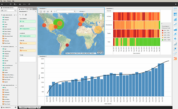
You can see Exasol in action below. Note that, Tableau already has a native connection to Exasol.


Exasol does one thing and one thing extremely well. Its high-performance, in-memory, MPP database is specifically designed for in-memory analytics. Exasol analytic database achieves lightning-fast performance with linear scalability by combining in-memory technology, columnar compression and storage, and massively parallel processing.

Since 2014, EXASOL has maintained its position as the undisputed leader in TPC-H benchmarks.  From data volumes that range from 100GB right up to 100TB, EXASOL holds the number one position - by a significant margin - over other solutions, for both raw performance and price-performance.
Exasol also offers out-of-the-box support for R, Python, Java and Lua. EXASOL also allows you to integrate the analytics programming language of your choice and use it for in-database analytics. It can easily connect to your existing SQL-based BI, reporting and data integration tools via ODBC, JDBC, .NET as well as a JSON-based web socket API.

Thursday, April 27, 2017

Qlikview to Tableau Migration

Tableau is one of the most popular Business Intelligence software in the market today. Many organizations are adapting Tableau recently and trying to migrate from their old Business Intelligence platform to Tableau. In this post, we will focus on QlikView to Tableau migration.

Effort needed to migrate from QlikView to Tableau depends on the way your QlikView software is implemented. In some cases, the data needed for QlikView Dashboard is completely prepared in a 3rd party tool so when migrating to Tableau, you do not need to convert ETL (extraction - transformation - load) code. But in most cases, ETL for QlikView is implemented using Qlik's own query language, AQL (QlikView is based upon patented technology called Associative Query Logic (AQL)).

Tableau does not provide a native ETL functionality so when migrating from QlikView to Tableau, you will probably need a 3rd solution to implement ETL for Tableau.

The exception above is of course keeping QlikView for ETL and just converting QlikView in-memory data to Tableau's native data set, TDE. But this usually involves, keeping two software licenses under maintenance.
Qlikview to Tableau Migration
QlikView to Tableau Migration
So usually, Qlikview to Tableau migration requires :
1 - Selecting an ETL tool to migrate QlikView AQL code to
2 - Migrating QlikView AQL code to new ETL logic
3 - Reimplementing the dashboards

Yes, there is no product/tool that does automatic migration from Qlikview to Tableau dashboards. You need to manually implement the dashboards in Tableau. Traditionally, QlikView scripting language is richer than Tableau's own expression language so you will also need to handle some in dashboard calculations in ETL when migrating to Tableau.

Though looks difficult, the task is achievable, especially if you outsource the Qlikview to Tableau migration work to a company who knows both QlikView and Tableau. Here is one such company.

Monday, April 24, 2017

Tableau Data Integration

Tableau may be a great data visualization tool but it has very limited functionality for data blending and data integration. Worse, most customers misunderstand "self service business intelligence concept" and think that they will get Tableau and without any data integration they can connect to the databases and create visualization (customers are actually made to believe this with Tableau's sales pitch).

Unfortunately, most business data is stored in complex relational database management systems or ERP which is very difficult, if not impossible to connect directly. Thus, many companies buying self service business intelligence solution realize that they cannot use it effectively due to this limitation.

Solution for this Tableau data integration problem is developing a  data integration with a non-Tableau application which is purpose built for this function. This data integration layer will simplify, consolidate and usually enrich the complex transactional data and will make it available for business users to easily develop visualizations. It will also transfer the query load from transactional system to this intermediary stage so the dashboards will also work faster. Such intermediary Tableau data integration layer became more crucial in the big data age.

Since Tableau deploys ease of use of "Drag-and-Drop", ideally the data integration system should also have the same drag-and drop capability and free of scripting. Luckily there are drag-and-drop data integration software out there and some are open source such as Pentaho.

There are drag-and-drop data integration software out there and some are open source such as Pentaho.
You can download Tableau Data Integration Services brochure to find out more : Enterprise Tableau Data Integration and Management Paper.

If you are having problems in Tableau data integration and data management, an expert Tableau services help may be very useful. In this case you should choose a Tableau consultancy firm, which will guide you in the process and implement the actual Tableau data integration layer.

Wednesday, April 19, 2017

Marketing Performance Analysis Dashboard

Marketing data analysis allows marketing people to align strategies to address market shifts, customer sentiment, and developing trends. Used correctly, a data analysis dashboard for marketing can boost marketing ROI through better targeting and campaign performance.

This Marketing Performance Analysis Dashboard, named Marketing 360, is an online business intelligence demo app brings together data from multiple sources into a one-stop-shop view. Analyze Marketing's performance across the organization from digital performance of the website to pipeline and install base engagement.

The demo application is composed of below screens to analyze different details and aspects of the marketing data :

Marketing Performance Dashboard View - Summarizes Awareness (Total Visits), Pipeline (Number of Opportunities Created) and Engagement (Net New Logos).

Awareness View - This section analysis visits to company site through Web, Social Media and Inbound (CRM).

Pipeline View - This section shows overall pipeline, marketing contribution to this pipeline as well as marketing influenced pipeline.

Engagement View - This section analysis penetration, community and partners.

The application is freely accessible online. To access it, fill in Data Analytics with Qlik Demo/App Request Form and don't forget to select Marketing Performance Analysis Dashboard from drop-down menu).

Marketing Performance Analysis Dashboard - Marketing 360
Marketing 360 - Marketing Performance Analysis Dashboard

Thursday, April 6, 2017

Tableau subscription pricing model

Tableau Software is finally making the big change in the way it sells its business intelligence products: they have announced their new Tableau subscription pricing for all its products, including Tableau Desktop and Tableau Server. These new pricing model will potentially lower the threshold for users looking to gain access to a full-fledged analytics platform.

Tableau subscription prices are now as below :
  • Tableau Desktop Personal subscription price is US$35 per user per month
  • Tableau Desktop Professional subscription price is $70 per user per month
  • Tableau Server subscription price is US$35 per user per month
  • Tableau Enterprise offerings prices are not public but this is also available under  Tableau subscription model.
Tableau perpetual prices are $1000 for Tableau Desktop Personal, $2000 for Tableau Desktop Professional and $1000 for Tableau Server per user. The perpetual model also comes with 20% yearly license maintenance.

Since Microsoft Power BI entered the market 2 years ago, there is a growing market pressure on Tableau and its rival Qlik to lower the prices or provide flexible subscription models. This new Tableau pricing model is in line with customer demand and industry trends, and will significantly reduce the initial expense of deploying Tableau business intelligence. Under subscription model, customers will also gain full access to frequent product updates without having to purchase a perpetual software license.

“Many customers have told us they prefer to purchase software through a subscription model to more easily access the products they want, reduce upfront expenses and increase flexibility,” said Adam Selipsky, president and CEO of Tableau.

Tableau subscription pricing model
Tableau subscription pricing offers affordable access to one of the best Business Intelligence solution available today.
This move will make it easier for Tableau to compete in a very crowded BI market. Tableau customers surveyed for Gartner’s Magic Quadrant were always happy overall with Tableau software, but they were often frustrated with the company’s rigid pricing policies.

Tableau's rival Qlik has also announced their subscription model this year in January.

Tuesday, December 22, 2015

Self-service Business Intelligence for Commercial Property Leasing

Commercial Real Estate Leasing is an extremely competitive sector of the Real Estate Industry and the players are required to be imaginative and have information at their fingertips to avail of the opportunities that arise as well as quickly respond to government, economic and market pressures that might challenge their business models. Having market and business metrics at the tips of your fingers therefore becomes a necessity.

Interactive Business Intelligence gives Commercial Real-estate professionals number of benefits:

  • Allows you to have a data based strategy for real estate portfolio optimization.
  • Provides a broad spectrum of self-service, easy to use business intelligence tools with customizable levels of access,
  • reporting or analytics per user.
  • Allows for both internal and external performance measurement and benchmarking.
  • Interactive BI breaks down multidimensional Data mashups with beautiful, rich data visualizations that support your
  • natural ability to spot patterns.

Self-service Business Intelligence for Commercial Property Leasing

Download the white paper here for a step-by-step introduction to Self-service Business Intelligence for Commercial Property Leasing.

Click2Analyze Sales Performance Analysis Dashboard

Your ability to track, analyze, and understand all aspects of your sales – what is being sold to which customer, when and by whom – is critical to identifying profitable customers. It is also important to keep track of your company's and sales people's sales performance to keep the company sales at top.

KMS Click2Analyze Sales Performance Analysis dashboard is compatible with any ERP system enabling companies to analyze their sales performance, giving you the full range of analysis, from the dashboard to the individual transaction.

Now with Click2Analyze Sales Analysis dashboard, you have complete visibility to business-critical customer, sales, product, budget, and channel data in a single, powerful yet easy-to-use business performancemanagement application.

Click2Analyze Sales Performance Analysis Dashboard can easily be integrated with your enterprise systems, even for companies running different ERP and CRM systems in differentdivisions. The dashboard provides a rapid ROI due to its rapid deployment and ease-of-use.

Sample Analysis
  • What is my market share per country and product?
  • What are my target sales and how are my current sales against these target values?
  • How many customers were acquired, retained or lost in the present month, quarter or year?
  • What are my lost sales due to lost customers? 
  • What is the frequency of purchase of my active customers?
  • Who are my high selling and highly profitable or low selling but highly profitable customers?
KMS Sales Performance Analysis Dashboard
The KMS Sales Analysis dashboard is being used by more than 100 companies is Asia Pacific to drive growth and boost sales.

The package consists of:
  • KMS Click2Analyze Sales dashboard
    • Executive dashboard
    • Sales Analysis dashboard
    • Customer Statistics dashboard
    • Portfolio Analysis dashboard
    • What-if Analysis dashboard
    • Detailed Report dashboard
    • KPI dashboard
  • Software licenses for 5 named users
  • One year of maintenance
  • User training
You can find more details here : KMS Click2Analyze Sales Dashboard Product Page

Wednesday, December 9, 2015

QlikView 12 Released

Qlik has finally released the new version of its business intelligence platform, QlikView 12. The major change in the QlikView 12 compared to QlikView 11 (which was released in 2011) is the data engine. QlikView now uses the same QIX Associative Data Indexing Engine (QIX) that powers Qlik Sense.

Other than the data engine improvement, QlikView also has enhancements in its security and mobile experience. All functions on web client are now available on touch devices without limitations.  Other changes are improved clustering, native connectors to web services and accessibility of Data Market to QlikView.

Qlik has released a new platform, Qlik Sense, in September 2014, after two years without any major release and the release date of QlikView 12 was since awaited by existing users of the platform.

The last major release of QlikView was QlikView 11 released in 2011. Since the company was releasing a new version in every year the expectation was that Qlik (then called QlikTech) would release QlikView 12 in 2012. But QlikView 12 has not been been released or talked about until late 2015.

In early 2013, Qlik started to talk about a new platform called QlikView.Next. It was expected to be the next QlikView but Qlik released the desktop edition of the product in 2014 and renamed it to Qlik Sense.

QlikView.Next is renamed as Qlik Sense because it is not the next version of QlikView. It is a new business intelligence platform. Its data loading and cleansing engine and expression engine seems to be same as QlikView but front end is entirely different:

QlikView is a tool for situations where you want prepared business applications, i.e. applications created by developers who put a lot of thought into the data model, the layout, the charts and the formulae; and deliver the applications to end-users who consume the applications. We call this Guided Analytics. The end-user has total freedom to explore data, select, drill down and navigate in the information, and can this way discover both questions and answers in the data. The end-user is however limited when it comes to creating new visualizations. This type of situation will without doubt be common for many, many years to come. 
Qlik Sense is a tool for situations where you don’t want to pre-can so much. Instead you want the user to have the freedom to create a layout of his own and in it, new visualizations; charts that the developer couldn’t imagine that the user wants to see. You want Self-service data discovery, which means a much more active, modern, engaged user. In addition, Qlik Sense is much easier to use when you have a touch screen, and is adaptive to different screen sizes and form factors. On the whole, Qlik Sense is a much more modern tool.
Source : QlikView and Qlik Sense

Qlik Sense is not QlikView 12
Qlik Sense is not QlikView 12. In fact, Qlik Sense is not QlikView at all.

My estimation was that they would release a new QlikView version named QlikView 12. And  I was hopefully this new server will support both QlikView and Qlik Sense as front end. For example Access Point of QlikView 12 would display both QlikSense and QlikView applications. I wrote since both Qlik Sense and QlikView have common expression and data engine, it should not be difficult". It seems like this feature is not on the roadmap at all.

Monday, August 31, 2015

Qlik Sense Cloud

Qlik's self-service business intelligence Qlik Sense now has a cloud based offering which is named Qlik Sense Cloud. This is a hosted, Software as a service, version of Qlik Sense where you can privately share your applications with others.

Qlik Sense Cloud pricing information is currently not available and in fact, the current version is free! You can add up to 5 users freely to view your Qlik Sense application on your cloud. Currently the total app size is restricted to 1 GB and each Qlik Sense application cannot be more than 25 MB in size.

Below, you can watch a nice introduction and getting started to Qlik Sense Cloud video.


You can simply create your Qlik Sense applications on Qlik Sense Desktop (also freely available) and upload them to your Qlik Sense cloud. Below in Qlik Sense Cloud - Registration and Orientation video, Michael Tarallo from Qlik shows how easy it is to register with Qlik Sense Cloud.

Monday, August 17, 2015

Financial Data Analysis by Jedox event in Singapore

Jedox is an Excel based financial planning software. Financial data is often difficult to audit and unreliable because of ineffective controls in Excel. The issues surface in overworked teams, manually reconciling data scattered across multiple systems and countries. Traditional BI/PM software needed specialised technical teams to develop and maintain them. Waterfall implementations meant Finance filled out requirement documents, explained basic finance concepts to the technical team - and then waited for the result. The business process (that Finance was still ultimately responsible for) was no longer under Finance’s control. To manage this, agile companies adopt the Jedox Suite. Jedox gives you unified planning, consolidation and reporting in one intuitive solution.

Knowledge Management Solutions, an authorized Jedox partner in Singapore, is having a free event to introduce this great platform to finance specialists in Singapore at 3pm - 5pm, on 28th August 2015. The address of this free Jedox event is Singapore Management University 60 Stamford road
Singapore, 178900.

For more details and registration, please visit Register for Jedox Finance Data Analysis event. Watch a short video of Jedox below to see the capabilities.

Tuesday, August 11, 2015

Retail Store Performance Dashboard Demo

Retail Store Performance dashboard demo is a free, online QlikView demo which showcases how an interactive business intelligence platform can be used to analyze the performance of stores from a regional level all the way down to the individual store level. The user can analyze sales versus budget, sales versu target, customer satisfaction, Year to date scorecard for regions, as well as detailed sales trends and numbers. The application also has an integrated map chart where the user can perform geospatial analysis.

The Retail Store Performance dashboard ties corporate strategy to store level execution at all levels of the store operations hierarchy.  Timely and accurate store performance metrics can be analyzed in the corporate office, in a store, or through a mobile device for traveling store operations and field management.

You can access the application by filing Data Analytics with Qlik Demo/App Request Form (select "Retail Store Performance Dashboard Demo" in the drop-down menu).

QlikView Retail Store Performance Dashboard
Retail Store Performance Dashboard showcases how QlikView can be used to analyze retail store data from regional level all the way down to the individual store level.
About QlikView

QlikView is one of the most popular business intelligence platforms which offers revolutionary in-memory, associative data analysis at your finger tip. Focused on easy and smooth end user experience, the platform enables easy search and access to data with state-of-the-art visualization as well as Google like easy to use and intuitive experience.

OEE Analysis Dashboard by QlikView

Overall Equipment Effectiveness (OEE) provides an overall measure of performance for a process. Developed by Seiichi Nakajima in the 1960s to evaluate how effectively a manufacturing operation is utilized, OEE is commonly used as a key performance indicator (KPI) in conjunction with lean manufacturing efforts to provide an indicator of success.

OEE Analysis Dashboard by QlikView is a rare freely available business intelligence example which provides a performance overview for manufacturing, provide diagnostic capabilities in order to improve performance over time to understand the current level of performance:

  • What is it getting better or worse? 
  • Why is my performance at its current level? 
  • What are the drivers behind the performance? 
  • By machine, By cell, By time period? 
  • What resources do I invest where to have the biggest impact?

The application sits on top of a shop floor data collection system and would contains information about the performance of shop floor equipment, including the number of pieces produced, hours of runtime and downtime and causes for downtime.


OEE Calculation  formula is Availability x Performance x Quality:

  • Availability is a measure of how much the process is available vs how much time it was supposed to
  • be available, it is measured as (actual uptime)/(scheduled run time)
  • Performance measures how fast the process runs, it is measured as (pieces produced per unit time) /
  • (standard rate for process)
  • Quality measures the quality of the process, it is typically measured as first pass yield: (Good pieces
  • on first try – no rework) / (total pieces input to process)
You can reach the online application and whitepaper about the app here : Data Analytics with Qlik Demo/App Request Form (select "OEE Analysis Dashboard by QlikView" in the drop-down).


QlikView OEE Analysis Application Dashboard View
OEE Analysis Application Dashboard View
About QlikView

QlikView is one of the most popular business intelligence platforms which offers revolutionary in-memory, associative data analysis at your finger tip. Focused on easy and smooth end user experience, the platform enables easy search and access to data with state-of-the-art visualization as well as Google like easy to use and intuitive experience.

Monday, August 10, 2015

Microsoft Power BI Desktop

Microsoft’s cloud-based business analytics tool, Power BI, came out with a brand new addition in late July 2015, Power BI Desktop. Officially named Power BI Designer, this free desktop tool aims business analysts and can be used to analyze data in a wide range of data sources. Power BI is also capable of ETL (Extract, Transform & Load) and can cleanse, transform and model interrelationships between the data; explore the resulting mashed up datasets.

Microsoft Power BI Desktop can create interactive reports and dashboards with simple drag and drops and these reports can then be published to the Power BI service for use by end users.

As Microsoft announced earlier in 2015, users will be able to choose between two versions of Power BI – a free service and a paid one (Power BI Pro), which comes with additional features and data capacity, costing US$9.99 per user per month.

Microsoft indeed has a very powerful platform offering for business intelligence but it has been relatively weak in presentation layer of BI. The new Power BI Desktop, which also first time in Microsoft's BI journey freed presentation from MS Excel, may well change that. Power BI online services are also quite easy to use. You can setup an account with your work email and immediately enjoy free services. Paid service as seen above is also not expensive and only comes at US$9.99 per user per month.

Currently the platform is only on cloud and no option to install it in-house. This will definitely prevent a lot of companies to seriously adapt it but its free entry price, ease of use and minimum setup requirements, it will probably be a very powerful cloud based self-service BI platform.

You can watch a 3 minutes Getting Started with the Power BI Desktop below.

How Qlikview works?

The core feature of QlikView is an in-memory, associative data model which feeds the visualization in a very unique way. In a traditional business intelligence application, the data visualization layer interacts with data through queries which are basically scripts executed by the platform. So if you for example select a country to drill-down to the sales numbers in that country, the data visualization layer runs a script, queries the data, retrieves the data from the data layer and updates the charts and reports in the screen.

QlikView on the other hand do not use this query mechanism. Application and data layer are tightly integrated in QlikView and data relationships are handled in engine level not application level. This means the QlikView charts and reports are integrated with in-memory data model and they know how to filter themselves when user drills down.

The mechanism above help QlikView developers to write significantly less software scripts which shortens the development and makes maintenance easy. Plus, in-memory integration of QlikView application layer and data model enables fast execution which usually eliminates the necessity to aggregate the operational data for performance reasons.


Wednesday, August 5, 2015

MicroStrategy Singapore Symposium

MicroStrategy has announced that 2015 MicroStrategy Symposium Series is coming to the Marina Bay Sands on October 21st. In this event, MicroStrategy will showcase how MicroStrategy 10 brings ease-of-use to true enterprise-grade analytics. Latest in Enterprise Analytics, Mobility, and Security will also be shared. You can have first hand experience of how MicroStrategy 10 sets new standards for data discovery, big data, advanced analytics, and more.

MicroStrategy Singapore Symposium will be packed with keynotes, technical sessions, and workshops focused on enterprise analytics, mobile, and security. The full agenda is available online.

Visionary keynotes from MicroStrategy executives and customers
Informative sessions on data discovery, big data, enterprise security, and much more
Hands-on workshops with MicroStrategy 10
The opportunity to network with technology innovators, partners, and sponsors

All attendees will receive a complimentary copy of MicroStrategy Desktop 10 (a $600 value). During the conference, attendees will also get to attend hands-on workshops to gain first-hand experience with MicroStrategy 10 and its revolutionary enterprise-ready data discovery and visualization capabilities.

You can see the details and full agenda at MicroStrategy Singapore Symposium 2015 page.

MicroStrategy Desktop 10

Tuesday, August 4, 2015

QlikView for SAP: How to unlock the value of your data hidden in SAP

QlikView is one of the most popular business intelligence platform today. Its popularity is not an accident. With its super fast and user-friendly data discovery interface, rapid development cycle, fast response time, it provides a very capable platform to extract the hidden value in the enterprise data.

SAP is on the other hand one of the most popular ERP solutions in the market today. Although it also provides BI capabilities, many customers choose QlikView as their BI platform to extract data from SAP. With QlikView, you can consolidate information from SAP BI, SAP R/3 or any other data source easily and then search and analyze this data with Google-like ease and speed. QlikView also provides a QlikView Connector for SAP Netweaver which enables SAP customers to get easy and quick access to all the data hidden in different SAP systems in QlikView.

KMS, an authorized QlikView partner in Singapore is having a free event named "QlikView for SAP: How to unlock the value of your data hidden in SAP" on 13th August 2015, 9:30am - 11am, Singapore Management University. In this event several aspects and benefits of using QlikView as data analysis and business intelligence platform on top of SAP installation.

QlikView for SAP event in Singapore will present the benefits of QlikView BI platform for SAP users.

You can follow the link or image below for details and registration :

QlikView for SAP Event


Tuesday, July 14, 2015

Free Tableau Demo in Singapore for manufacturing

Tableau Software has recently released their brand new data visualization platform version, Tableau 9.0 in April and in June officially released the new version in Singapore. If you are keen to try out this mind blowing self-service business intelligence platform, you can download a free Tableau download (14-days trial) and also watch this 23 minute full demo of the platform, Getting Started with Tableau.

For those in Singapore, Knowledge Management Solutions, an official Tableau Software partner based in Singapore (with offices in Kuala Lumpur, Bangkok and Jakarta) is conducting a full 1.5 hour demo of Tableau on 31st July 2015 - 9:30am - 11am in Singapore Management University campus.

You can see the details and form to register here : Tableau for Business Users Event.

This Tableau 9.0 demo for Business Users event is regularly conducted and this session targets manufacturing. Still, it is offers a demo for every one including non-manufacturing industries to experience how Tableau can help them to make sense of their data.

Tableau in Singapore
Tableau for Business Users offers a 1.5 hour Tableau demo in Singapore.

Monday, April 13, 2015

Oil and Gas Analytics

Oil prices shrunk from $115 a barrel to less than $50 a barrel forcing energy firms to reconsider their strategy. Break-even price of producing a barrel of oil needs to be reduced to counter falling prices. Reports have stated that better data analysis could boost production of oil & gas companies by up to 6-8 percent.

There is a whitepaper about Oil and Gas Analytics from Knowledge Management Solutions, a Singapore based Business Intelligence and Analytics solution provider, explains how BI can boost Oil & Gas Industry :
  • Exploration and production analysis
  • Loss code analysis
  • Drilling and Completion analysis
  • Health, Safety, Environment & Security analysis
  • Production Optimization analysis
Oil and Gas Analytics dashboard screen - Production Surveilance
A sample Oil and Gas Analytics dashboard screen - Production Surveilance
You can download the White paper on Interactive Business Intelligence for Oil & Gas Industry.


Wednesday, February 25, 2015

Gartner Magic Quadrant for Business Intelligence and Analytics Platforms 2015

Gartner's infamous Magic Quadrant for Business Intelligence and Analytics Platforms for 2015 has just been released. You can see the quadrant below. We will write about it a little later.

Also compare it with Magic Quadrant of 2014 (see below).

For now some notes :


  • Tableau's stellar rise to leaders quadrant and now becoming the outliner performing better than all others is much more pronounced now in 2015. And this is still before the exiting new release of Version 9. Gartner says "Tableau has clearly defined the market in terms of data discovery, with a focus on "helping people see and understand their data." It is currently the perceived market leader with most vendors viewing Tableau as the competitor they most want to be like and to beat. At a minimum, they want to stop the encroachment of Tableau into their customer accounts."
  • Tibco Software fell from leaders to visionaries. Gartner says "The future of Tibco itself is uncertain, following the acquisition of the company by Vista Equity Partners (which closed in December 2014). In the near term, Tibco will operate as a privately held single entity, as it did when it was publicly traded, but the longer-term intentions of Vista are not yet clear. The ingredients for a leading BI and analytics platform are present with Tibco's many strategic acquisitions; however, Vista will need to implement major changes to address the sales model and execution issues, which have plagued Tibco historically, in order to regain traction and once again be recognized as a market leader."
  • Logi Analytics is moving closer to leaders quadrant. 


Gartner Magic Quadrant for Business Intelligence 2015

Gartner Magic Quadrant for Business Intelligence 2015

Tuesday, January 6, 2015

Navision Sales Analyzer Dashboard

Navision Sales Analyzer is a Business Intelligence Dashboard for sales which built on the powerful Tableau data visualization platform. Developed by Singapore based Knowledge Management Solutions, it empowers Microsoft Navision users to analyze and visualize data and to make strategic calls about sales and marketing.
  • Plan revenue
  • Analyze the impact of promotions
  • Discover performance of products
  • Compare product market share Vs. market growth
  • Perform market basket analysis
  • See customer buying behaviour clearly
You can watch a video introduction of Navision sales analyzer below. If you would like to find out more, KMS has a free demo event to introduce the product to the market. Click here to join : KMS Navision Sales Analyzer Demo.