www.enhencer.com
Turn Data to Profit in Minutes
Predict customer's behavior with the most practical Automated Machine Learning platform.

www.enhencer.com/churn-prediction
Churn Prediction
Focus only on 5% of your customers who are 90% likely to leave.Know who they are and how they behave.Take the right actions to the right customers at the right time by decreasing your marketing costs.

www.enhencer.com/purchase-propensity
Predict Purchase Propensity
Increase the positive return of such campaigns up to 90% and learn why and how the marketing campaigns are made effective against which customer group.

Showing posts with label Qlik Sense Demo. Show all posts

Wednesday, January 9, 2019

Getting Started with Data Analytics and Visualization Webinar

In this free webinar, you will discover how self-service data analytics solution Qlik Sense can help anyone discover insights that Excel or query-based BI tools simply miss, driving data literacy for all skill levels. You will learn to create interactive data visualizations which allow easy drill-down and slice-and-dice and support data driven decision-making process. There will be a step-by-step data visualization dashboard development demo as well as a Q&A in the demo.

Getting Started with Data Analytics and Visualization webinar on January 25th 2019 and February 1st 2019 between 09:30am – 10:30am.

 Getting Started with Data Analytics and Visualization Webinar

Event Information:
Venue                   : Webinar (details will be provided after registration)
Date / Time        : Two alternative sessions are available :
January 25th 2019 – 09:30 to 10:30 AM
February 1st 2019 – 09:30 to 10:30 AM
Agenda                :
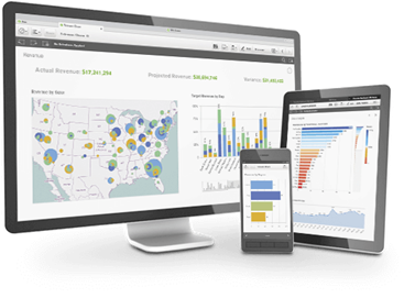
-          Introduction to Qlik Sense Data Visualization Platform
-          Self – Service Data Visualization Development Demo
-          Q & A
About Qlik
Qlik® is the leading data analytics platform and the pioneer of user-driven business intelligence. Its portfolio of cloud-based and on-premise solutions meets customers’ growing needs from reporting and self-service visual analysis to guided, embedded and custom analytics, regardless of where data is located. Customers using Qlik Sense®, QlikView® and Qlik® Cloud, gain meaning out of information from multiple sources, exploring the hidden relationships within data that lead to insights that ignite good ideas. Headquartered in Radnor, Pennsylvania, Qlik does business in more than 100 countries with over 45,000 customers globally.
About Avensys Consulting Pte. Ltd.
Avensys is a leader in providing technology enabled business solutions and services. Since inception, Avensys has helped clients use IT more efficiently to improve their operations and profitability, focus on core competencies and achieve business results such as increased agility, innovation and profitable growth. Our in-depth technical knowledge coupled with industry experience and our unique methodologies enable us to successfully deliver and meet our customer’s expectations.
http://aven-sys.com

Wednesday, April 19, 2017

Marketing Performance Analysis Dashboard

Marketing data analysis allows marketing people to align strategies to address market shifts, customer sentiment, and developing trends. Used correctly, a data analysis dashboard for marketing can boost marketing ROI through better targeting and campaign performance.

This Marketing Performance Analysis Dashboard, named Marketing 360, is an online business intelligence demo app brings together data from multiple sources into a one-stop-shop view. Analyze Marketing's performance across the organization from digital performance of the website to pipeline and install base engagement.

The demo application is composed of below screens to analyze different details and aspects of the marketing data :

Marketing Performance Dashboard View - Summarizes Awareness (Total Visits), Pipeline (Number of Opportunities Created) and Engagement (Net New Logos).

Awareness View - This section analysis visits to company site through Web, Social Media and Inbound (CRM).

Pipeline View - This section shows overall pipeline, marketing contribution to this pipeline as well as marketing influenced pipeline.

Engagement View - This section analysis penetration, community and partners.

The application is freely accessible online. To access it, fill in Data Analytics with Qlik Demo/App Request Form and don't forget to select Marketing Performance Analysis Dashboard from drop-down menu).

Marketing Performance Analysis Dashboard - Marketing 360
Marketing 360 - Marketing Performance Analysis Dashboard

Tuesday, January 3, 2017

Twitter Analysis Dashboard demo

Twitter is one of the most influential and important social media site on the planet today. Most companies want to know (or should want to know) what people are talking about them, their products and competitors. Which companies get tweeted about most? Us or competitors? How does the sentiment trend over time for us and competition?

It is obviously impossible to manually track hundreds and thousands of tweets about your company and competition to get a sense of market sentiment. You need an automated twitter analysis tool to help. Like a Twitter Data Analysis Dashboard.

Here in this post, we will introduce a sample Twitter Analysis Dashboard which nicely summarizes publicly available data. The Business Intelligence platform used here is Qlik Sense. The application uses  Qlik Web Connectors  to extract Twitter data and automatically loads and visualizes the data for you.

You can access the application using this link : Twitter Analysis Dashboard. The dashboard is available online and you can play around to get sense of how modern business intelligence platforms can help you to analyze publicly available social media data.

Twitter Data Analysis Dashboard Qlik Sense
Twitter Analysis Dashboard Qlik Sense. This sample dashboard helps you to analyze the number of tweets and retweets of the airlines to see which airline gets mentioned the most and if the tweets have a positive or negative sentiment.


Sentiment Analysis using Twitter data. How does the sentiment trend over time for the companies?

Thursday, September 3, 2015

Free Qlik Sense / QlikView Demo Session in Singapore on September 16th

Qlik has recently released a new version and more mature version of Qlik Sense, Qlik Sense 2.0, and also a brand new concept / platform named Qlik Analytics Platform. Besides, Qlik Sense now also has a cloud version where you can use this cutting edge data visualization software as SaaS.

There will be a QlikView / Qlik Sense introduction event at 9am - 11am on 16th September 2015 in Singapore Management University. In this event, you will not only have a chance to learn about Qlik product and platform family, you will also have chance to see the newest features of Qlik Sense and QlikView.

This event is a free and for registration and details you can visit Free Qlik workshop for Business Users and IT professionals: Interactive Business Reporting and Analysis with QlikView & Qlik Sense page.

Qlik Sense
Qlik Sense
Imagine analytics so intuitive, anyone in your company could easily create personalized reports and dynamic dashboards to explore vast amounts of data and find meaningful insights. And imagine if this could be done while ensuring accuracy and reliability of data and analytics. That’s Qlik Sense —a revolutionary visual analytics platform that supports self-service visualization, guided analytics apps and dashboards, embedded analytics, and reporting, all within a governed framework that offers enterprise scalability and trust for IT.

QlikView
The QlikView Business Discovery platform delivers true self-service BI that empowers business users by driving innovative decision-making.

Friday, August 14, 2015

Sales Performance, Pipeline and Productivity Data Analysis Dashboard Demo by Qlik Sense

Would monitoring the health of your pipeline by region, industry, function, rep, division, etc. help you improve forecast accuracy? Are you remaining competitive in your industry and can you identify areas for improvement to increase your win rate? 

Sales Performance, Pipeline and Productivity Data Analysis model holds the sales opportunities in pipe and closed business. Additional information like region, division, customer industy, segment and function is available to dissect, analyze and forecast. Finally, there is a competitive analysis view to see who the company compete against and the company's effectiveness in those competitive situations.

The application consist of the followign views :

  • Dashboard - This view shows the current quarter's sales pipeline.
  • Performance / Effectiveness Dashboard - This view helps to analyze the current quarter sales performance (Quote, Pipeline, Revenue) by region and Sales rep.
  • Pipeline Analysis Dashboard - This dashboard helps to deconstruct the sales pipeline by aging, sector and function.
  • Quote Analysis Dashboard - This dashboard helps to verify quote attainment by region and sales representative.
  • Competitive Analysis Dashboard - This dashboard helps to explore the competitive landscape and review wins and losses.
You can access this Qlik Sense Sales Performance Analysis Dashboard here : Sales Performance, Pipeline and Productivity Data Analysis Dashboard


Sales Performance, Pipeline and Productivity Data Analysis Dashboard Demo by Qlik Sense

Supply Chain - Inventory and Product Availability Dashboard Demo by Qlik Sense

This Supply Chain - Inventory and Product Availability Dashboard demo application provides visibility into inventory levels (in-store, depot, and in transit) and potential insights into availability through out of stock measures and sales information. Lack of availability can mean lost potential sales. Too much inventory creates excess costs.

The demo app is designed to give visibility into the Retail environment to Consumer Products companies. The source data is the Retailer who makes information available from their store EPOS and depot systems to the Consumer Goods company.

This demo gives consumer goods company and any retailers a picture of product stock levels in store, depot and in transit, as well as sales analysis. The app supports Consumer Products companies in their effort through allowing users to reduce out-of-stocks and lost sales potential, as well as identifying potential alternative sources of replenishment.

This data can be viewed at the multiple levels and locations, in providing Consumer Products companies with detailed insights to support key business processes such as forecasting, demand and supply management.

This Qlik Sense demo is available online and you can access it by filling Data Analytics with Qlik Demo/App Request Form (select "Supply Chain - Inventory and Product Availability Dashboard Demo by Qlik Sense" in drop down).

Data visualization for suppply chain and inventory
This Qlik Sense supply chain, inventory and product availability dashboard demo illustrates how you can use Qlik Sense to potentially gain insights through visualizations and try to optimize inventory and availability not just one side of the equation.
About Qlik Sense

Qlik Sense analytics software is a business intelligence tool designed for the enterprise. Developed by Qlik, the company behind popular QlikView Business Intelligence Platform, Qlik Sense makes visual dashboard creation simple and intuitive, but doesn’t stop there. Qlik Sense also makes it easy to explore the data so you can understand what’s happening and why. Ask questions. Follow your intuition. Seamlessly navigate vast amounts of data from multiple sources. Then share your insights visually and accurately with other users directly or through the cloud.